Your CTAs might be costing you conversions. From unclear wording to poor placement, small mistakes can lead to big losses. Fixing these issues can significantly improve your results.
Here are the 7 most common CTA mistakes and how to avoid them:
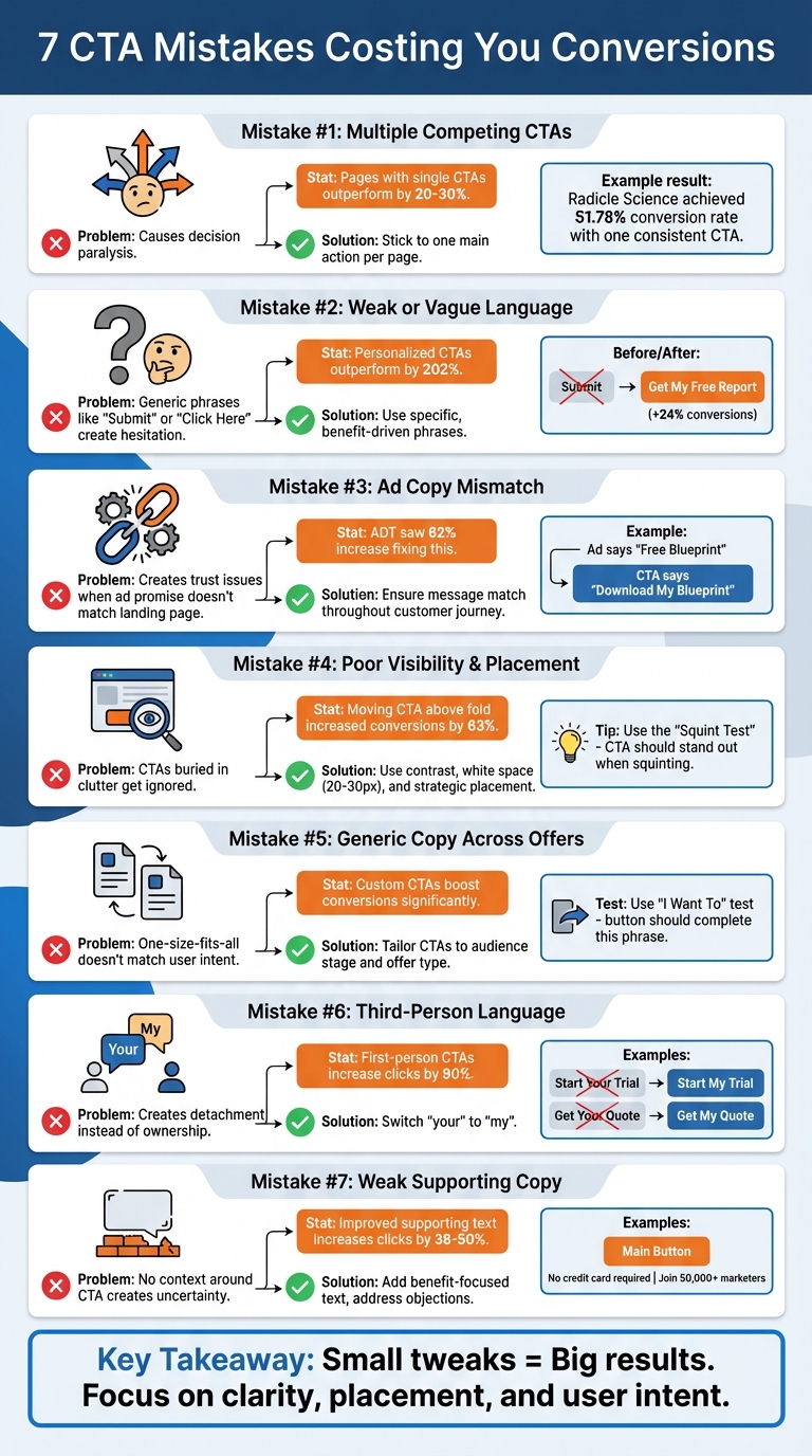
- Too Many CTAs: Overwhelms users and causes decision paralysis. Stick to one main action per page.
- Weak Language: Generic text like "Submit" confuses users. Use specific, benefit-driven phrases like "Get My Free Guide."
- Ad Copy Mismatch: If your CTA doesn’t match your ad’s promise, trust breaks. Align your messaging for a smooth user journey.
- Poor Visibility: CTAs buried in clutter or with low contrast get ignored. Make them stand out with clear design and placement.
- Generic Copy Across Offers: Tailor CTAs to match user intent and stage in the buying journey.
- Not Using First-Person Language: "Start My Free Trial" performs better than "Start Your Free Trial" by creating ownership.
- Weak Supporting Text: Add clear, benefit-focused text around CTAs to address hesitations and highlight value.
Key takeaway: Focus on clarity, placement, and user intent to make your CTAs more effective. Even small tweaks can lead to big improvements in conversion rates.
7 Common CTA Mistakes and How to Fix Them
These Mistakes KILL Conversion Rates
sbb-itb-89b8f36
1. Using Multiple Competing CTAs
Too many choices can overwhelm users, leading to decision paralysis and lower conversions. In fact, pages with a single, clear call-to-action (CTA) typically outperform those with competing options by 20-30%.
The problem isn’t just the number of buttons - it’s when they direct users toward different actions. For instance, Radicle Science needed to enroll 10,000 participants in clinical trials. They designed a landing page with one consistent CTA: "Join the Study", repeated at three strategic points. The result? A 51.78% conversion rate, with 3,443 conversions from 6,649 visitors.
"Three identical 'Book a Demo' buttons reinforce the message, while differing ones create confusion." - Waseem Bashir, CEO, Apexure
Another example is Scanitto, which removed a competing "Buy Now" button to clarify their conversion path. By focusing on one primary action, they eliminated confusion and boosted conversions.
If a secondary action - like a "Sign In" link - is necessary, keep it subtle. Use ghost buttons or plain text links so they don’t visually compete with the main CTA. Your primary action should always command attention. Try the "Squint Test": if the main CTA doesn’t stand out when you squint at the page, adjust its contrast or add more white space around it.
A clear, singular CTA makes decision-making easier, ensuring users focus on the action you want them to take.
2. Weak or Vague CTA Language
Using generic phrases like "Submit", "Click Here", or "Learn More" can harm your conversion rates because they fail to clarify what users will gain from their actions. As Andi Coombs, Senior Marketing Manager at KlientBoost, puts it:
"SUBMIT is the hellspawn of terrible CTAs across the universe. If 'Submit' is your primary call-to-action button, your conversion rates feel sad and poor".
When your CTA language is unclear or overly generic, it creates hesitation. Users, especially those pressed for time, are unlikely to click if they’re unsure about what happens next.
The key to crafting effective CTAs lies in specificity and perceived value. For example, replacing "Download Now" with "Get My Free Report" makes the benefit and ownership explicit. Personalized CTAs, such as those using first-person phrasing, can significantly outperform generic ones - by as much as 202%. Even small changes, like switching "Start your free trial" to "Start my free trial", can boost conversions by 24%.
The "I Want To" Test
A great way to evaluate your CTA is by using the "I Want To" test. Your button text should seamlessly complete the phrase "I want to..." from the user's perspective. For instance, "Get my plan" fits naturally, while "Submit" falls flat. Prioritize action-oriented verbs and top PPC tools such as "Claim", "Discover", "Join", or "Start" instead of passive or vague commands like "Continue" or "Register".
To illustrate the impact of strong CTAs, ADT achieved a 62% increase in conversions simply by refining their CTA language. The takeaway? Clarity beats creativity when it comes to CTAs. As Magnetic Marketing explains:
"If your CTA could sit on any website in any industry, it isn't doing its job. No one wakes up wanting to click a button. They want the outcome".
Here’s a quick comparison of weak versus strong CTAs:
| Weak CTA | Strong Alternative | Why It Works |
|---|---|---|
| Submit | Get My Plan | Highlights a specific deliverable |
| Click Here | Claim Your Discount | Provides a clear financial benefit |
| Learn More | See How It Works | Sets clear expectations for the next step |
| Sign Up | Join the Club | Creates a sense of belonging |
| Contact Us | Talk to an Expert | Frames the action as a valuable consultation |
3. Misalignment Between Ad Copy and CTA
When your ad sets one expectation but your landing page CTA delivers another, it can feel like a bait-and-switch to users - even if the offer itself hasn’t changed. This disconnect not only confuses visitors but also chips away at the trust your ad worked to establish. It disrupts the natural flow of the user journey, making it harder to convert prospects into customers.
A mismatch between your ad’s promise and the landing page CTA forces users to pause and rethink their decision, which often stalls conversions. Samuel Edwards, Chief Marketing Officer at PPC.co, emphasizes the importance of alignment:
"Your CTA copy should match user intent and clearly reflect what the PPC ad promised".
When messaging is inconsistent, it creates friction that can lead to higher bounce rates, wasted ad spend, increased acquisition costs, and lower Quality Scores on platforms like Google Ads.
The fix? Ensure a "message match" throughout the customer journey. For instance, if your ad offers a "Free Blueprint", your CTA should clearly say "Download My Blueprint" rather than something generic like "Contact Us" or "Submit". By mirroring the keywords, phrases, and visuals from your ad on your landing page, you create a smooth experience that not only encourages conversions but can also improve ad relevance and reduce cost-per-click.
It’s also essential to tailor your CTA to match the user’s intent. For example, someone looking for educational content might respond better to "Download Guide", while a high-urgency query might require a more immediate action like "Get Help Now". ADT, for instance, saw a 62% boost in conversions when they adjusted their CTA to better align with user expectations. Magnetic Marketing sums it up perfectly:
"If your CTA changes the story, trust collapses".
Consistency in messaging across all touchpoints ensures a smoother user experience and keeps engagement levels high.
4. Poor CTA Visibility and Placement
A hidden CTA can ruin your chances of converting visitors. If people can’t spot your button, they won’t click it - simple as that. This often happens when CTAs are too small, buried in clutter, or overshadowed by other visuals. The result? You’re asking users to act but making it hard for them to figure out how.
Contrast makes all the difference. The actual color of your button matters less than how much it stands out on the page. Waseem Bashir, CEO of Apexure, sums it up perfectly:
"White space around a CTA button is not empty space – it is attention space. The more breathing room your button has, the more the eye gravitates toward it".
To make your CTA stand out, surround it with at least 20–30 pixels of white space. Not sure if it’s prominent enough? Try the squint test - blur your vision slightly by squinting at the page. If the CTA isn’t the most noticeable element, adjust its size or contrast. Once you’ve nailed the design, focus on where it’s placed.
Placement is just as important as design. For example, in March 2026, IMD Business School repositioned their "Download a Brochure" CTA from below a lengthy section to above the fold and added a secondary CTA after video testimonials. The result? Conversions jumped from 3.91% to 6.38% - a 63% increase. Similarly, Flare.io, a cybersecurity SaaS company, saw a 65% rise in demo bookings in just one week after moving their CTA above the fold and changing the button text to "See Flare in Action".
Strategic placement ensures users notice your CTA at the right time. Don’t stop at one button - repeat your CTAs in key areas like the hero section, mid-page, and footer. This reinforces their visibility and can boost performance by 20–35%. For mobile users, sticky CTAs (buttons that stay visible as users scroll) can increase conversions by 17% without affecting bounce rates. And remember, your primary CTA should always appear above the fold, where 57% of viewing time happens.
Finally, make sure your buttons are easy to click. On mobile, CTAs should be at least 44–48 pixels tall to accommodate thumb taps. For desktop, aim for buttons that are 200–350px wide and 50–60px tall. Use bold, filled buttons for your main action and outline or ghost buttons for secondary options to avoid overwhelming users with too many choices. Buttons placed in the upper third of a page get 73% more visibility, and proper positioning alone can increase conversions by up to 161%.
5. Using Generic CTA Copy Across Different Offers
Generic CTAs like "Submit" or "Click Here" can weaken your message when used across different offers. Why? They don't tell users what to expect - are they downloading a guide, starting a trial, or requesting a quote? This ambiguity forces people to pause and think, which can increase hesitation and lower conversions.
Another issue is mismatched CTAs that don't align with where users are in their buying journey. For example, asking a first-time blog visitor to "Buy Now" is a tough sell - they're likely not ready to commit. On the flip side, a vague "Learn More" button on a product page might miss the chance to engage someone ready to make a purchase. The key is to adjust your CTA based on both the audience and the offer. For instance, small businesses might respond better to "Free" plans, while enterprise clients may look for details on paid features or professional consultations from top PPC agencies.
Customizing your CTA can lead to impressive results. ADT, for example, saw a 62% boost in conversions after tweaking their CTA text. A helpful trick is the "I Want To" test: your CTA should complete the sentence "I want to..." from the user's perspective. Instead of "Submit", try something like "Get my free guide" or "Start my free trial." You can also use Google Ads performance tools to identify which CTAs drive the most conversions. This approach makes the action clear and appealing.
Claire Grayston from Wishpond puts it perfectly:
"The language of your CTA has a large impact on conversion, so leave little to a potential lead's imagination with clear, persuasive text".
For high-intent channels like Google Search ads, use CTAs like "Book a Demo" that require more commitment. On platforms like social media, where audiences may be less ready to act, go for lower-commitment options such as "Download the Guide." Matching your CTA to the offer and audience ensures your message resonates and avoids the trap of one-size-fits-all wording.
6. Not Using First-Person Language in CTA Copy
Using third-person language in CTAs can hurt user engagement by creating a sense of detachment. Phrases like "Start Your Free Trial" or "Get Your Quote" might feel more like commands than invitations, making users less likely to take action.
Switching "your" to "my" can make a big difference. This subtle change taps into the endowment effect, where people feel a sense of ownership over something before they even have it. For example, Michael Aagaard from Unbounce tested two versions of a CTA: "Start your free 30-day trial" versus "Start my free 30-day trial." The result? A staggering 90% increase in click-through rates with the first-person version.
Casey Miller from Casey's SEO breaks down the psychology behind this:
"When users read 'my,' their brain automatically begins to take possession of the outcome. They're no longer being directed - they're choosing to claim something for themselves."
This approach isn't just theory - it's backed by numbers. Personalized CTAs using first-person language have shown to outperform generic ones by as much as 202%, with real-world tests delivering improvements ranging from 24% to 90%.
Here’s how you can tweak your CTAs:
- "Download the Guide" becomes "Download My Free Guide"
- "Reserve a Consultation" becomes "Reserve My Consultation"
- "Add to Cart" becomes "Add to My Cart"
Try testing these updates on high-traffic buttons. You can also explore expert-recommended PPC strategies to further optimize your conversion paths. Just like clear language and strategic placement, first-person terms can enhance your CTAs, making them more engaging and effective.
7. Weak Supporting Copy Around the CTA
A strong CTA (Call-to-Action) button is just the beginning. The supporting text around your CTA plays a crucial role in clarifying its value and nudging users toward conversion.
A CTA button doesn’t operate in a vacuum. Without clear supporting copy, users might hesitate, unsure of what happens next or why they should take action. This is where benefit-driven supporting text comes in, addressing doubts and reinforcing the value of clicking.
AJ Beltis, Senior Content Marketing Manager at HubSpot, puts it perfectly:
"Succinctly pitching the value of what you're linking out to on a page with an abundance of copy and visual distractions can act as an unambiguous directive on what readers should do once on the page."
This supporting text isn’t just filler - it’s a key component of your conversion strategy. It complements the CTA button by eliminating uncertainty and emphasizing what's in it for the user.
Here’s how you can improve it: Add specific, benefit-focused statements next to your CTA. Swap out vague phrases like "Submit" for something more enticing, such as "Get instant access to the 50-page SEO audit template" or "Join 50,000+ marketers receiving daily tips." These adjustments make the value crystal clear, giving users a strong reason to act.
You can go a step further by addressing potential objections. Adding friction-reducing phrases like "No credit card required" or "Cancel anytime" can ease concerns. Pairing these with urgency (“Offer expires in 2 hours”) or social proof (“11,000 marketers trust us”) can create the momentum needed to convert hesitant visitors.
Even small tweaks can make a big difference. For example, changing button text from "Order Information" to "Get Your Free Quote" increased clicks by 38%. Similarly, tailoring the supporting copy to align with the visitor’s stage in the buying journey can improve click rates by 20–50%. The secret? Focus on the outcome users will gain, rather than simply directing them to take an action.
Next, check out the comparison table that outlines these CTA optimization strategies in greater detail.
Comparison Table
Building on the tactics discussed earlier, the table below highlights how weak CTAs can be transformed into more effective ones. These improved examples showcase better language, design, and placement strategies.
| Weak CTA Example | Improved CTA Version | Primary Improvement | Impact |
|---|---|---|---|
| "Submit" | "Get My Free Ebook" | Replaces vague text with value-driven, specific language | Clearly communicates what the user will receive |
| "Click Here" | "Start My Free Trial" | Uses action-oriented verbs and first-person "My" | Encourages ownership and clarifies the next step |
| Small button hidden in design elements | Large button with contrasting color | Increases visibility and reduces "button blindness" | Prevents the CTA from blending into the background |
| "Buy Now" & "Free Trial" (equal weight) | "Start Free Trial" (button) & "Buy Now" (text link) | Establishes a clear visual hierarchy to prevent indecision | Reduces choice paralysis by guiding users to one primary action |
| "Register" | "Register Now - Limited Spots!" | Adds a sense of urgency to prompt immediate action | Leverages FOMO to encourage faster decision-making |
| "Join Our Newsletter" | "Send Me the Weekly Tips" | Focuses on the benefit the user receives rather than the process | Shifts from company-centric to user-centric language |
| Bottom of a long landing page | Sticky/scrolling sidebar | Keeps the CTA ever-present as the user scrolls | Ensures the button is accessible when the user is ready to convert |
| Blue button on blue background | Orange button on blue background | Uses high contrast to draw attention | Ensures immediate visibility even with minimal focus |
These improved CTAs are designed to be specific, benefit-oriented, and visually prominent. For example, ADT saw a 62% boost in conversions simply by refining their CTA copy and text type. Similarly, Susty-Party achieved a 250% increase in conversions after adding a clear and compelling CTA to their homepage.
Conclusion
After exploring the seven common CTA mistakes, it’s evident how each one can negatively affect your conversions. A call-to-action acts as the bridge between conversion stages, and when it misses the mark, the entire process suffers. Issues like competing CTAs or poorly written supporting copy create unnecessary obstacles, pushing potential customers away.
The good news? These errors can be corrected. Simplify the decision-making process by focusing on a single, primary CTA. Use first-person, benefit-driven language to make your message resonate. Enhance visibility with contrasting colors and enough whitespace, and ensure your messaging remains consistent from ad to landing page. These adjustments not only smooth the user journey but also strengthen your overall marketing efforts. By fine-tuning these key elements, you can align your landing page with the goals of your PPC campaigns.
"CTAs are your gateways from one stage of the conversion funnel to the other... a Call to Action gone wrong at any stage is a conversion gone wrong."
– Aditi Gupta, VWO
Take time this week to evaluate your current CTAs. Try the "squint test" to see if your button stands out visually, confirm its attention ratio is 1:1, and check if your CTA language completes the sentence "I want to...". Don’t forget to A/B test your updates - small changes in color, placement, or wording can lead to noticeable improvements in conversions.
At the heart of many conversion gaps are these seven avoidable mistakes. Start reviewing your CTAs today and apply these practical fixes to see meaningful results.
FAQs
How many CTAs should a landing page have?
A landing page works best when it zeroes in on one clear call-to-action (CTA). This focused approach eliminates distractions, helping visitors understand exactly what they need to do. By streamlining the page around a single goal, you make it easier for users to take action without second-guessing.
How can I A/B test CTA wording and placement?
To fine-tune your call-to-action (CTA), it's all about testing systematically. Try experimenting with different button text to see how subtle changes affect conversions. For example, swapping "Sign Up Now" with "Get Started Today" might resonate differently with your audience.
Placement matters, too. Test positioning your CTA in various spots, like above the fold (where users see it without scrolling) or at the end of your content. Each location can influence user behavior in unique ways.
Leverage A/B testing tools to track key metrics like click-through rates. These tools help you analyze performance and identify what works best. By refining your approach based on real user behavior, you can continually improve both the wording and placement of your CTAs. It's an ongoing process, but the results are worth it!
What should my CTA say if the visitor isn’t ready to buy?
If someone visiting your site isn’t ready to make a purchase, your call-to-action (CTA) should give them a reason to stay engaged. For example, you could offer a free resource like an eBook or a helpful guide. Another option is to invite them to subscribe to your newsletter. These small steps help you stay on their radar, build trust, and keep the connection alive with your brand.