Responsive design directly affects how well your PPC campaigns perform. If your landing pages don’t work smoothly on mobile devices, you’re likely wasting ad spend. Here’s why responsive design matters:
- Mobile Traffic Dominates: Over 50% of web traffic comes from mobile devices. If your landing page isn’t mobile-friendly, you risk losing most of your audience.
- Faster Loading Drives Conversions: Pages that load in under 3 seconds see significantly lower bounce rates. A one-second delay can cut conversions by 7%.
- Improved User Experience: Responsive pages eliminate frustrations like pinching, zooming, or slow navigation, making it easier for users to convert.
- Higher ROI: Responsive design improves Quality Scores, reduces ad costs, and ensures clicks turn into meaningful actions.
Key Takeaways:
- Start with Mobile-First Design: Focus on small screens first, ensuring touch-friendly buttons and simple layouts.
- Speed is Critical: Compress images, use CDNs, and keep the design clean to load pages faster.
- Consistency is Key: Match ad copy with landing page content to build trust and boost conversions.
Responsive design isn’t just about aesthetics; it’s about delivering a better experience that maximizes your PPC investment.
🚀 PPC Landing Page Best Practices: How to Create High-Converting Landing Pages 💰💰
Core Responsive Design Principles for PPC Landing Pages
Creating effective PPC landing pages means following design principles that ensure your pages perform well across all devices. Whether someone is browsing on a smartphone, tablet, or desktop, these principles can help maximize conversions.
Start with Mobile-First Design
Designing with a mobile-first approach means focusing on the mobile experience before scaling up to larger screens. This method is especially important given the dominance of mobile traffic today. Instead of beginning with a desktop layout, mobile-first design starts with the constraints of smaller screens and builds upward.
For PPC campaigns, prioritize mobile-friendly features. A single-column layout works best, as it adjusts naturally to various screen sizes. Make sure navigation is touch-friendly by designing tappable buttons and links. Adding a sticky call-to-action (CTA) bar at the bottom of mobile screens ensures users always have easy access to your main offer.
This approach also aligns with search engines' mobile-first indexing policies, which could positively impact your rankings.
Focus on Fast Loading and Simple Layouts
Speed is critical. Pages that load in less than three seconds tend to have a 53% lower bounce rate, while 53% of mobile users abandon sites that take longer than three seconds to load. For PPC campaigns, slow loading times can waste ad spend as users leave before engaging with your content.
To speed things up, compress images and fonts to reduce load times without sacrificing quality. Remove unnecessary scripts and plugins, as each extra element can slow down your page and increase the risk of technical issues . Using a Content Delivery Network (CDN) can also improve loading times by serving content from servers closer to your audience.
A simple layout not only speeds up your page but also keeps visitors focused on your conversion goal. Remove distractions and unnecessary elements, and use white space strategically to improve readability and draw attention to your key messages and CTAs.
As Mailchimp wisely notes:
"A well-crafted PPC landing page makes the difference between a lost opportunity and a new customer."
Match Ad Copy with Landing Page Content
Consistency between your ad copy and landing page content is essential for building trust and improving conversions. Companies that maintain strong message alignment between their ads and landing pages can see conversion rates increase by as much as 25%.
To achieve this, make sure the keywords and phrases in your PPC ads are mirrored in your landing page headlines. This reassures visitors that they’ve landed in the right place. Visual consistency is also key - use the same colors, fonts, and imagery in both your ads and landing pages to create a cohesive experience.
For example, InVideo’s ads target beginner video editors with promises like "No video editing Skills Required" and "Make your Own Videos in 3 Easy Steps." Their landing page reinforces this by showcasing video templates, editing tools, and a step-by-step guide that aligns perfectly with the ad’s messaging.
Another great example is StudioSuits’ campaign for men’s wool tuxedos. Their ads and landing pages feature sleek, minimalist designs with matching color schemes, typography, and high-quality images, ensuring a seamless transition for users.
If your ad highlights a special offer, make sure it’s prominently displayed on your landing page. Whether it’s a discount, free trial, or bonus, visitors should see it immediately. Hiding these details below the fold or in fine print can disrupt the message match and hurt your conversions.
As Mladen Maksic, CEO of Play Media, puts it:
"The more seamless the ad-to-page transition, the better the landing page performance."
To maintain this alignment, use A/B testing to refine your ads and landing pages. Experiment with different headlines, offers, and visuals to find the combination that resonates most with your audience.
How Responsive Design Increases PPC Conversions
When your PPC landing pages adjust effortlessly to any device, responsive design plays a key role in improving user interactions and driving conversions.
Better User Experience with Less Friction
Responsive design removes the hurdles that often frustrate users and lead them to abandon your landing pages. Imagine someone clicking on your PPC ad from their smartphone. If they land on a page that's easy to navigate, loads quickly, and displays correctly, they're much more likely to stay and take action.
The numbers tell the story: mobile users are five times more likely to leave a site that isn't mobile-friendly. In other words, a non-responsive landing page could be costing you valuable leads before they even see what you're offering.
Think about the difference in filling out a form on a non-responsive page versus a responsive one. On a non-responsive page, users might struggle with excessive pinching, zooming, or scrolling. On a responsive page, the design adapts - forms are easy to fill out, buttons are sized for tapping, and the content flows naturally.
Gabriel Shaoolian, Founder and CEO of Digital Silk, sums it up well:
"A responsive site not only improves usability, but it also boosts SEO rankings, improves engagement, and builds trust by adapting to the user's preferred platform effortlessly."
This seamless experience builds trust instantly. When users see that your page works perfectly on their device, they feel more confident in your brand and are more likely to share their information or make a purchase. That trust translates directly into better engagement and conversion rates.
Effects on User Engagement Numbers
Engagement metrics highlight how responsive design boosts PPC performance. For instance, mobile sites that load within 5 seconds can lead to 70% longer user sessions and lower bounce rates. Plus, even a 0.1-second improvement in load time can increase conversion rates by 8% and average order value by about 9%. For PPC campaigns, these improvements mean higher Quality Scores and lower cost-per-click rates.
Nina Jelic, Lead Product Strategist at Infinum, emphasizes this point:
"On mobile, every second counts. Responsive design helps users access the information they need without friction, making trust and conversions easier to earn."
A user-friendly mobile design can also boost click-through rates by up to 50% compared to non-optimized sites. This encourages users to interact more with your content and calls-to-action, directly aligning with your PPC goals by reducing wasted ad spend and increasing conversions.
Data and Real Examples
The power of responsive design isn't just theoretical - it delivers real results. A well-designed user interface can increase a website's conversion rate by up to 200%, and an outstanding UX design can take it up to 400%.
Take Walmart Canada as an example. In 2025, they saw a 98% increase in mobile sales after revamping their digital presence with a mobile-first approach, creating a seamless shopping experience for mobile users. While this wasn't solely a PPC effort, it demonstrates how responsive design can significantly impact revenue.
The cost savings are just as compelling. One PPC case study revealed that a client saved $70,000 per year by turning off ads that directed traffic to non-converting mobile pages. Another client saved $18,000. These examples make it clear: non-responsive landing pages aren't just ineffective - they can drain your ad budget. Every click leading to a frustrating mobile experience is money wasted.
Talia Wolf from Getuplift highlights the importance of mobile-first design:
"It's worth creating dedicated MOBILE landing pages. The go-to approach is creating your landing page on desktop and letting automatic responsive design take care of mobile. However, creating your landing page for mobile first will ensure all the elements are in the right place. It's simple really, pages built specifically for mobile in mind get better results. If you're using a landing page builder you can simply switch between mobile and desktop mode. You'll be surprised how simple these builders make it to use a different hero image or headline for your mobile pages."
The data is clear: responsive design isn't optional if you want to succeed with PPC. With mobile devices making up about 62.69% of global web traffic, failing to prioritize responsive design means missing out on the majority of your potential audience.
Best Practices for Responsive PPC Landing Pages
Responsive design plays a big role in boosting user engagement and conversions, but to truly maximize your PPC landing pages, you’ll want to follow some key best practices. These strategies focus on design principles that directly impact conversions, ensuring your pages perform effectively across devices.
Place Clear CTAs Above the Fold
Your call-to-action (CTA) needs to be front and center - visible on every device without scrolling. Targeted and personalized CTAs can convert 42% more visitors into leads than generic ones. So, make sure your most important buttons, like "Get Started" or "Download Now", are easy to spot.
For mobile users, this becomes even more crucial. Design CTAs that are at least 44x44 pixels to make tapping effortless. Use bold, action-driven text and contrasting colors to make your buttons pop, whether viewed on a bright smartphone screen outdoors or a desktop monitor indoors.
Here’s an example of the impact: A 55% increase in subscribers was reported after optimizing responsive CTAs. This improvement came from ensuring the buttons were well-sized, well-placed, and tailored for each device type.
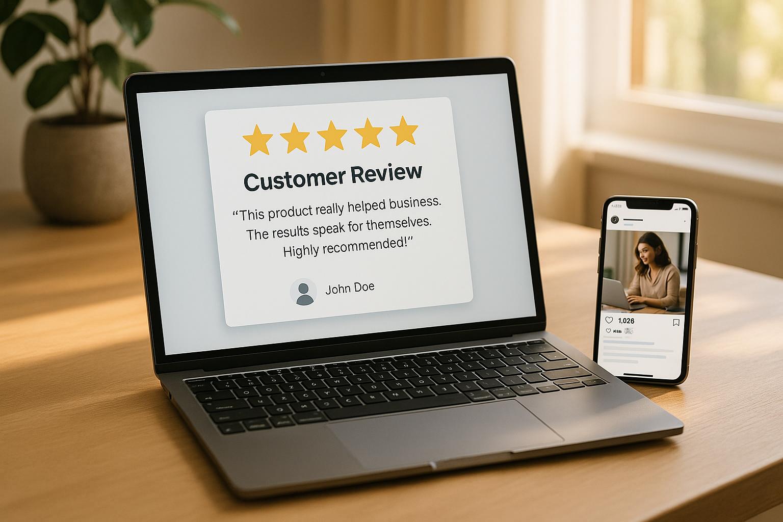
Add Trust Elements That Work on All Devices
Trust signals - like security badges, testimonials, and customer logos - are essential for PPC conversions. In fact, 66% of customers say trust signals make them more likely to buy. But these elements need to be just as effective on a smartphone screen as they are on a desktop.
For desktop users, you might include detailed testimonials with customer photos and quotes. On mobile, condense this information while keeping it impactful. Carousel formats or prominently displayed star ratings with short excerpts work well.
Security badges, like SSL certificates, should be visible but not overpowering. Position them near forms or checkout buttons, ensuring they scale appropriately for smaller screens. Similarly, customer logos can be arranged in responsive grids - use pairs or single columns on mobile to prevent clutter.
| Content Type | Desktop Approach | Mobile Approach |
|---|---|---|
| Headlines | Can be longer | Keep concise |
| Body Text | 16-18px, wider columns | 16px minimum, narrower columns |
| Paragraphs | Can be longer | Keep under 3-4 lines |
| Features | Can show more | Focus on top 3-5 |
| Images | Larger, more detailed | Smaller, focus on key elements |
| Forms | Multi-column layout | Single column, fewer fields |
Test and Analyze Performance Regularly
Responsive design isn’t a "set it and forget it" solution. Regular testing ensures your landing pages keep up with changes in devices and user behavior. In 2023, SEMrush reported 313% more visits on mobile compared to desktop for the top 100 U.S. websites. This makes mobile performance testing non-negotiable.
A/B testing is a great way to refine layouts. For instance, a two-column form might work well on desktop, but a single-column version may convert better on mobile. Use tools like Google Analytics 4 to track device-specific performance metrics - set up UTM parameters to see which devices drive the most conversions. Monitor bounce rates, session durations, and conversion rates by device type.
Heat mapping tools like Hotjar or Microsoft Clarity can provide insights into user behavior, showing where people click, scroll, and spend the most time. These insights help you fine-tune element placement for each screen size.
Waseem Bashir, Founder & CEO of Apexure, sums it up well:
"Mobile-first design means starting with the smallest screen and scaling up. Button placement, page length, and adapting to the desktop are key considerations. With more users on mobile, we must ensure the same storytelling as on desktop, but in a scroll-friendly format."
Track your results over time - monthly and quarterly. If you notice a drop in mobile conversion rates after making updates, dig into whether those changes affected usability on smaller screens. With 97% of Americans owning a mobile phone, any mobile responsiveness issues could directly hit your bottom line. Regular testing ensures your landing pages stay effective, saving both your conversions and your PPC budget.
sbb-itb-89b8f36
Responsive vs Non-Responsive Landing Pages: Side-by-Side Comparison
Let’s break down how responsive and non-responsive landing pages stack up against each other, especially when it comes to PPC campaigns. Since landing page design directly impacts user experience and conversion rates, it ultimately plays a big role in your revenue.
Responsive landing pages adapt seamlessly to any screen size, offering clear text, properly scaled elements, and easy-to-click buttons. On the other hand, non-responsive pages often force users to pinch, zoom, and scroll awkwardly, which can frustrate visitors. And the numbers don’t lie - responsive designs see conversion rates of 11.7% compared to 10.7% for non-responsive designs. That 1% difference may seem small, but it can significantly affect your PPC revenue.
Responsive pages make it easy for visitors to read, navigate, and take action without any hassle. Non-responsive designs, however, can lead to higher bounce rates as users struggle with clunky layouts.
Loading speed is another key factor. A delay of just one second can slash conversions by 7%, and 53% of mobile users abandon sites that load too slowly. Responsive pages are often optimized for speed, ensuring smooth performance across devices. Non-responsive pages, meanwhile, may struggle with oversized images and inefficient code, especially on mobile connections.
Here’s a quick side-by-side comparison to highlight the differences:
Performance Metrics Comparison
| Metric | Responsive Landing Pages | Non-Responsive Landing Pages |
|---|---|---|
| User Experience | Optimized for all devices | Can frustrate mobile users with usability issues |
| SEO Performance | Improves mobile rankings | May face penalties in mobile search results |
| Conversion Rates | Higher (e.g., 11.7% on mobile) | Lower (e.g., 10.7% on mobile) |
| Loading Speed | Faster, thanks to device optimization | Slower, particularly on mobile |
| Maintenance | One adaptable design for all devices | Requires separate versions, increasing complexity |
Responsive designs also simplify maintenance. With a single version that works across all devices, you avoid the inconsistencies that often arise from managing multiple versions. Non-responsive designs can introduce messaging inconsistencies and lead to up to 25% lower conversion rates.
Here’s another reason to prioritize responsive design: non-responsive pages can waste your ad spend. A poor mobile experience leads to wasted clicks, higher acquisition costs, and less effective PPC campaigns overall.
It’s worth noting that 86% of the top landing pages are mobile-friendly. Considering PPC traffic converts 50% better than organic traffic, having a responsive design is essential for maximizing your ROI. Plus, faster load times not only improve user experience but also reduce bounce rates, giving your campaigns an extra edge.
Conclusion: Why Responsive Design Matters for PPC Success
Responsive design plays a crucial role in driving PPC success. When your landing pages adjust effortlessly to any device, you're not just enhancing user experience - you’re directly impacting your revenue. The numbers back it up: responsive design can boost conversion rates by up to 400%, while a poor mobile experience drives away 88% of online consumers, often for good. These benefits underscore the importance of responsive design, especially for PPC marketers.
Key Takeaways for PPC Marketers
Mobile traffic dominates PPC campaigns. More than half of all web traffic now comes from mobile devices, and by 2025, mobile is expected to account for 75% of all eCommerce sales . This trend makes mobile responsiveness not just a best practice but a necessity.
"In 2025, mobile-responsive design is essential for businesses looking to maintain strong online visibility and user engagement."
– Global Reach
Page speed is critical for ad spend efficiency. With 53% of mobile users abandoning pages that take more than three seconds to load, every second truly matters. Faster load times improve your Quality Score, lower your cost-per-click (CPC), and boost ad placement. On the flip side, if your landing page fails to deliver on the promises made in your ad, you risk wasting valuable ad dollars.
Consider this: one e-commerce brand saw its click-through rate (CTR) jump from 2.5% to 4.7% in just two months after optimizing its responsive design. This effort led to a 45% increase in conversion rates, a 35% reduction in bounce rates, and a 20% decrease in cost per acquisition. These results highlight how mobile-first, fast-loading design principles can transform campaign performance.
"Improved UX design creates seamless user journeys from ad impression to conversion. Clear messaging, visual consistency, mobile responsiveness, fast load times, and personalized experiences directly elevate click-through rates and overall campaign performance."
– Zigpoll
Tools and Resources to Elevate PPC Campaigns
To build on these performance improvements, it’s essential to arm yourself with the right tools. Responsive design success often hinges on leveraging expert resources and proven PPC tools. These tools are invaluable for optimizing campaigns, whether on platforms like Google Ads or Facebook Ads.
The Top PPC Marketing Directory (https://ppcmarketinghub.com) is a go-to resource for discovering the best tools and expert agencies. From A/B testing landing pages to tracking performance metrics, this directory connects you to specialists and solutions for campaign management, keyword research, ad copy refinement, and more.
FAQs
How does a mobile-first design improve PPC campaign performance?
Why Mobile-First Design Matters for PPC Campaigns
Designing with mobile users in mind is no longer optional - it’s essential. A mobile-first design ensures your PPC campaigns cater to the ever-growing number of people browsing on their smartphones and tablets. By focusing on mobile accessibility, you’re creating ads and landing pages that load fast, look great on smaller screens, and provide a seamless experience. The payoff? Higher click-through rates and conversion rates.
But that’s not all. Mobile-friendly ads often score better on platforms like Google Ads. A higher Quality Score can mean lower costs per click and better ad placements, which directly boosts your campaign’s ROI. With mobile devices now accounting for a major share of online traffic, adopting a mobile-first strategy isn’t just smart - it’s how you stay competitive and get the most out of your PPC efforts.
How does responsive design help reduce ad costs and improve ROI in PPC campaigns?
Responsive design improves how users interact with your website and ads by making sure they look and function well on any device or screen size. This not only boosts engagement but also increases conversion rates, ultimately helping to reduce your cost per acquisition (CPA).
When your ads are optimized to work seamlessly across different devices, you can connect with a larger audience without needing to raise your ad budget. This approach keeps your pay-per-click (PPC) campaigns efficient and helps you get the most out of your return on investment (ROI).
What are the best ways to test and optimize responsive PPC landing pages for better performance?
To fine-tune and improve responsive PPC landing pages, it's essential to monitor key metrics like click-through rates (CTR), bounce rates, and conversion rates. Tools such as Google Analytics and Google Ads can help you gather this data, offering insights into how visitors engage with your page.
Make A/B testing a regular part of your process. Test variations of elements like headlines, images, and calls-to-action to identify which combinations deliver the best performance. To dig deeper into user behavior, tools like heatmaps and session recordings can reveal valuable details - such as where users click and how far they scroll - helping you better understand their journey.
By consistently reviewing data and tweaking your approach, you can enhance the overall user experience and boost conversion rates for your PPC campaigns.