I judge a PPC form by the qualified leads it brings in, often using top PPC tools to track performance,, not just its submission count. Start by matching the form to your ad’s offer and asking only for details you need to deliver it or qualify the lead.
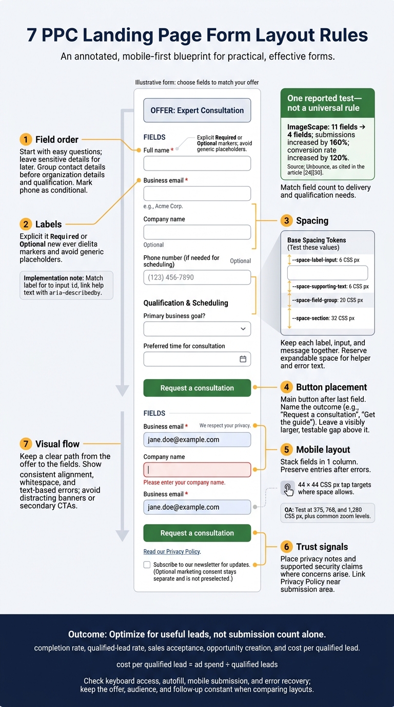
I use these 7 layout rules to help visitors finish:
- Field order: Start with easy questions; leave sensitive details for later.
- Labels: Keep clear labels above every input.
- Spacing: Keep each label, input, and message together.
- Button placement: Put the main button after the last field and name the outcome.
- Mobile layout: Stack fields in 1 column and preserve entries after errors.
- Trust signals: Place privacy notes and supported security claims where concerns arise.
- Visual flow: Keep a clear path from the offer to the fields to the button.
Fewer fields can help. Unbounce reports that ImageScape’s change from 11 fields to 4 increased submissions by 160% and conversion rate by 120%. But I treat that as a test result, not a rule for every offer.
My final check: <u>Can users finish the form, and do those submissions become useful leads?</u> I test mobile use, keyboard access, and error recovery, then compare completion rate, sales acceptance, and cost per qualified lead.
7 PPC Landing Page Form Layout Rules
30% Conversion Rate - PPC Expert Reveals The Only Landing Page Design You Need [Real Live Page]
sbb-itb-89b8f36
1. Start With Easy, Familiar Fields
Put the easiest required fields first. Name and business email take less thought than budget, project scope, or timeline. Save sensitive questions and those that need more thought for later.
After the click, this order can help the form feel quick to complete:
name → business email → company → phone, only if needed → qualification or scheduling.
Not every offer needs every field. Require a phone number only when the next step involves a call.
Give each field a clear purpose. Company information might guide account assignment; budget might determine service fit. If an answer doesn't guide follow-up, remove the field or make it optional.
Group related questions: contact details first, then organization details, then qualification or scheduling. Don't jump from email to budget and back to phone. Add section headings only when they help people scan the form.
Unbounce reports that ImageScape cut its contact form from 11 fields to 4, increasing submissions by 160% and conversion rate by 120%.
Test field order and count against qualified leads and post-submission lead quality as part of your PPC campaign optimization, not submissions alone. Once the order is set, use labels and spacing to make the form easier to scan.
2. Put Visible Labels Above Inputs
Place labels above inputs and keep them visible so PPC visitors can complete the form without rereading fields. Reserve placeholder text for examples or formatting cues.
Keep labels short, specific, and aligned with the offer:
Use “Company name,” not vague labels like “Details.”
Use sentence case and leave off trailing colons.
Connect labels to controls in the HTML. For standard fields, match each label’s for attribute to the input’s id. This lets screen readers announce the field and lets users click the label. Link help text with aria-describedby.
Label every field as required or optional, using the same style throughout. Don’t rely on color or a bare asterisk. Add required to required inputs, too.
Use brief help text only when it prevents mistakes or clarifies the format. Follow one pattern: label → short hint, if needed → input. Check that labels, hints, and required markers follow the visual scanning order during keyboard navigation and in screen reader output.
3. Keep Field Spacing Consistent
Keep labels closer to their inputs than to the next field group. Treat each label, input, and supporting text as one unit so users can see what belongs together. Equal spacing between every element blurs those boundaries.
Use consistent spacing tokens rather than setting separate margins for each field.
| Spacing token | Base value |
|---|---|
--space-label-input |
6 CSS px |
--space-supporting-text |
6 CSS px |
--space-field-group |
20 CSS px |
--space-section |
32 CSS px |
Reserve space below each field for helper and error text. Set a minimum height to limit layout shift, but let that space grow when the text wraps.
Apply the same tokens across breakpoints. On narrow screens, keep labels close to inputs. Increase the gap between field groups only when wrapped messages crowd nearby fields. Test at 375, 768, and 1,280 CSS px, plus common zoom levels, to check that labels, feedback, and the button stay visible and usable.
When comparing spacing systems, keep the offer, fields, copy, and traffic consistent. Track field-level errors, form completion, mobile completion, and qualified-lead rate - not just submissions. With spacing that makes the form easy to scan, place the button where the reading path ends.
4. Put the Submit Button After the Last Field
Place the primary button below the last field, aligned with the input column, where the eye naturally lands. Don’t put it above unfinished fields, in a sidebar, or below unrelated content. Make the next action clear, and use consistent spacing to separate the button from the fields.
Leave extra space above the button. Test the gap instead of treating it as a fixed rule.
Use outcome-specific button copy rather than Submit. Match the ad’s promise and tell users what happens next.
For a consultation request, use Request a consultation; for a downloadable guide, use Get the guide.
Add a short privacy note next to the button. Make secondary links look secondary, and keep them out of the path between the last field and the button. Maintain high contrast and a visible focus state.
On mobile, keep the same order in a single column.
5. Stack Mobile Fields in One Column
Keep the field order, but switch to full-width fields in a single column on mobile. This gives users a straight path through the form, with less scanning and fewer mistakes. Keep each label, input, help text, and error message together.
Switch to one column before the form starts to wrap, then test the breakpoints in your layout. Use 2 columns only when labels, values, and errors fit without wrapping. Keep the DOM order unchanged so autofill and keyboard navigation stay predictable.
Use semantic input types and matching autocomplete attributes to reduce typing:
Use
type="email"for email,type="tel"for phone numbers, and matchingautocompleteattributes for common fields.
Keep valid entries after errors so users can finish without reentering information or abandoning the form. Focus the first invalid field and place a short correction beside or directly below it. Leave enough space between controls for easy tapping, and use 44 × 44 CSS px tap targets where space allows.
Test on recent iPhone and Android devices in Safari and Chrome. Check autofill, keyboard actions, scrolling, and CRM value capture.
Once users can tap through the form and recover from errors easily, place trust signals near fields that may cause doubt.
6. Put Trust Signals Where Concerns Arise
Once the form is easy to scan, put trust cues where users may hesitate. Place privacy text beside personal-data fields, with a link to a readable Privacy Policy. Keep optional marketing consent separate from submission. Where applicable, use a clearly labeled checkbox that isn’t preselected.
Show current security proof beside sensitive fields. Group the proof with those fields using a subtle border or background. Avoid expired badges, unrelated seals, and security claims you can’t support. Add one short proof point beside the form on desktop or near the button on mobile, where users decide whether to act.
Remove trust content that slows completion, including pop-ups, animated badges, and large testimonial carousels. Keep privacy links legible and required disclosures close to the submit area, but leave the path between the last field and the button clear. Keep cues compact so users can scan down the form without interruption. Test placement using qualified-lead rate and cost per qualified lead.
7. Create a Clear Visual Path Through the Form
Once trust cues are in place, give readers a clear path through the form. Match the form title to the ad promise, then add a short line explaining the next step and any qualification criteria.
Align the heading, fields, help text, errors, and button along the same left edge. Use whitespace to guide the eye from the heading to the fields to the button.
Make the offer and button stand out with contrast. Label errors with text rather than relying on color alone. Remove extra banners, secondary CTAs, and navigation that draw attention away from the form.
Keep corrections in that same visual path. When users miss a field, show the error directly below it. Preserve valid entries after a failed submission so users don't have to enter them again.
Conclusion: Review the Layout and Measure Lead Quality
Review the seven rules as one system: field order, labels, spacing, button placement, mobile stacking, trust cues, and visual flow.
Before launch, test the form under the conditions users will face. Check keyboard navigation, autofill, errors, and mobile submission. Make sure the keyboard doesn’t cover the active field or button and users can submit without scrolling horizontally.
Match field count to the offer’s qualification needs, not the highest possible submission count. Keep fields that support delivery or qualification. Remove unused questions, but don’t cut qualification fields just to get more submissions.
Measure qualified-lead rate, completion rate, sales acceptance, opportunity creation, and cost per qualified lead (ad spend ÷ qualified leads). Google Ads supports importing offline qualified-lead and converted-lead outcomes, connecting form submissions to later CRM results.
When testing a layout change, keep the offer, audience, and follow-up process constant. Agree with sales on qualification criteria, then choose the layout that improves qualified leads once downstream results have had time to develop. Judge PPC landing pages by how well they fit the offer and produce useful leads, not just by how few fields they have.
FAQs
How do I balance fewer fields with lead quality?
Match form length to your campaign goals. If you want more leads, keep forms short and simple to reduce friction. If lead quality matters more, add 1 or 2 qualifying questions and accept that fewer people may submit the form.
A/B test shorter forms against forms with qualifying fields. Track form completion rates and cost per lead to find which option best supports your business goals.
When should I use a multi-step PPC form?
Use a multi-step form when you need more information to qualify leads while balancing lead volume and quality. Shorter, single-step forms usually create less friction and lead to fewer abandoned submissions. Splitting a longer form into steps lets you ask qualifying questions without overwhelming users.
Test different form lengths to see which best supports your conversion goals.
How long should I test a form layout change?
Run your form layout test for at least 1-2 weeks to account for daily and weekly traffic patterns. High-traffic campaigns may reach statistical significance within that window. Lower-traffic pages may need several weeks or months.
Aim to test over a full business cycle and reach a 90-95% confidence level before declaring a winner. Keep the test unchanged while it runs so your results stay reliable.